
Late to the party here, but I thought I’d post these new Harper Collins Narnia book covers by artist Owen Richardson. They came out in April 2025 for the 75th Anniversary of the publication of The Lion, the Witch, and the Wardrobe, considered the birth of the series. They are for the hardback versions of the books.
I did some research on the artist, Owen Richardson, and his background is in fantasy illustration. He did the artwork for the Warrior Cats series, the middle school books about clans of feral cats. He also did a lot of work for trading card series, e,g, Magic: The Gathering, and I can see that in these covers. In general, they’re more flashy and violent, more action-oriented and cinematic, than the Narnia covers of past decades.

As an artist, I think they are OK. Competent, but I’m not knocked out of the park by them (save for one — more later.) My favorite of them is Prince Caspian (to the left — unfortunately, the full wraparound cover was unavailable) which is odd because it’s my least favorite book. The composition is strong, there’s no unnecessary detail, and the color range is good; I feel the action and the dynamic nature of the scene. Even though the title character is not on the cover (and to be fair, on a lot of PC covers over the years, he isn’t) it conveys the plot nicely — old Narnia vs. new Narnia. (When you think about it, Caspian is a very passive character … he’s almost a bystander in his own book. It’s only in The Voyage of The Dawn Treader that he gets to shine.)
I’ve heard complaints from some fans that they look too AI generated. Which is unfair, because it’s the reverse: AI generations look like the artist’s style, which utilizes tons of layering and other manipulation in Photoshop or a like program. This style can look overdone if you’re not careful with the embellishment.
Here’s the rest of the artwork along with my critiques — click on the pics to see them full size.

The Lion, the Witch, and the Wardrobe. It’s OK, but having all the Pevensies fighting the Queen together, armed with weapons even, is a bait-and-switch. It doesn’t happen in the book! Still, I could tolerate if only Lucy was armed correctly; she had a dagger, according to Lewis, which was gifted to her by Father Christmas, so she should have been in a knife-fighting stance. And why do so many artists ignore that the witch has a golden crown on her head?
Good part: The composition is very dynamic, with the witch’s right arm and pointed knife following the arrow in Susan’s bow. Almost like the witch is marking Susan, choosing her as the one who will turn away from Narnia in the last book. The invisible line also leads to a rune carved into the stone table, which is the symbol for the planet Jupiter, an “easter egg” or hidden meaning, for fans in the know, of Michael Ward’s controversial planetary theory of the books. Which I myself don’t think is likely, but perhaps the artist was playing around with it rather than endorsing it.
Another good part: All these covers have different palettes, a range of limited but harmonious colors that codes them.
| The Lion, the Witch, and the Wardrobe
Prince Caspian The Voyage of the Dawn Treader The Silver Chair The Horse and His Boy The Magician’s Nephew The Last Battle |
Blue/aqua
Lavender/peach Navy blue/royal blue Jade green/grayish green Gold, ochre, tan Yellow-greens, gold Red, red, red |

The Voyage of the Dawn Treader. That ship looks much smaller than what’s described in the book, but I’ve got no complaints about the choice of scene even though the sea serpent encounter was only a minor incident in the journey. I like that Reepicheep is posed jumping into the air, limbs splayed in surprise or fright, looking ridiculous. I really don’t like that little Mouse.
Nitpick: Again there’s a bait-and-switch in that Lucy, Edmund, and Eustace are armed in their conflict with the sea serpent when they weren’t in the book — they merely push it off, and it’s Lucy’s idea!

The Silver Chair. I’m not comfortable with the titular chair looming in the background. It’s hard to tell what it is at first. It looks more like a Medieval cathedral or some woodwook in the Green Witch’s palace. Why couldn’t it have been normally sized?
Good parts: The artist wisely paid homage to Baynes’ original illustration in depicting this scene and giving the serpent sea-dragon fins AND a large size to coil convincingly around Rilian’s body. The back illustration is very cool and would work just as well as the front one for a cover. Richardson made a good decision in keeping Puddleglum’s back to us and the Earthmen shadowed and mysterious. The city is how I myself picture it.
Nitpicks: Jill was wearing a green gown with a red cloak, not a doublet, and did not participate in the serpent fight; she stood to the side fighting off nausea, Lewis states. Though I suppose she could have picked up a fireplace poker to defend herself as the picture suggests. But she should really be wearing the correct clothing.
Another nitpick: I’d like to see some gold or yellow-green highlights on the serpent.

The Horse and His Boy. It’s OK. It does its job. I prefer the covers showing Tashbaan because that’s where most of the action and conflict takes place, but this scene, showing Shasta and Aravis riding for their lives, is effective, even though I normally hate those covers that show the two being chased by a rather mundane lion. That’s not very exciting to me compared to the intrigue of city life or the trek across the desert. I like that the artist has placed Aslan at the top, in the sky — he appears to be guiding them, rather than chasing them. Which is, of course, what Lewis had him doing all throughout the book.
Good part: The tombs are cool and I think they’re effective as a stand-in for the city of Tashbaan. More planetary symbols here as carvings on the rock.
Nitpick: It looks like they’re in a sandstorm which is a peril not depicted in the book. But I can live with it.

The Magician’s Nephew. There’s a ring, and a ring inside a ring, and another ring, and it’s hard to tell where they meet up or are connected. I get that these are the green and yellow rings of the story, but why oh why are there three of them?
Good parts: Jadis is cool and Fledge is the proper color and size. Polly is waving at Aslan, who’s in the distance, as if indicating they’ve completed their task. Or maybe she’s telling the witch to stop or go away.
Nitpick: I’ve seen better covers of this book.
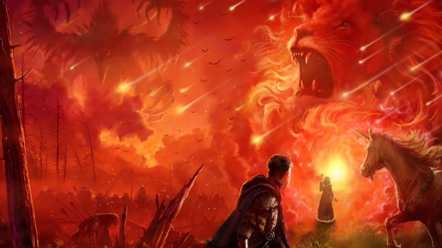
The Last Battle. This is truly the most apolcalyptic cover of this book I’ve ever seen! The artist pulls no punches here, commanding the reader’s attention with fire, falling stars like meteors, battle, and shades of blood. The depiction of Tash is different (and effective) too — more Corvid, less Aztec eagle.
Nitpick: Who is the gowned figure in the center with the crucifix supposed to be?
